©Richard Lowry, 1999-
All rights reserved.
Chapter 3. Introduction to Linear Correlation and Regression
Part 1
[Traducción en español]
Correlation and regression refer to the relationship that exists between two variables, X and Y, in the case where each particular value of Xi is paired with one particular value of Yi. For example: the measures of height for individual human subjects, paired with their corresponding measures of weight; the number of hours that individual students in a statistics course spend studying prior to an exam, paired with their corresponding measures of performance on the exam; the amount of class time that individual students in a statistics course spend snoozing and daydreaming prior to an exam, paired with their corresponding measures of performance on the exam; and so on.
Fundamentally, it is a variation on the theme of quantitative functional relationship.The more you have of this variable, the more you have of that one. Or conversely, the more you have of this variable, the less you have of that one. Thus: the more you have of height, the more you will tend to have of weight; the more that students study prior to a statistics exam, the more they will tend to do well on the exam. Or conversely, the greater the amount of class time prior to the exam that students spend snoozing and daydreaming, the less they will tend to do well on the exam. In the first kind of case (the more of this, the more of that), you are speaking of a positive correlation between the two variables; and in the second kind (the more of this, the less of that), you are speaking of a negative correlation between the two variables.
Correlation and regression are two sides of the same coin. In the underlying logic, you can begin with either one and end up with the other. We will begin with correlation, since that is the part of the correlation-regression story with which you are probably already somewhat familiar.
Correlation
Here is an introductory example of correlation, taken from the realm of education and public affairs. If you are a college student in the United States, the chances are that you have a recent and perhaps painful acquaintance with an instrument known as the Scholastic Achievement Test (SAT, formerly known as Scholastic Aptitude Test), annually administered by the College Entrance Examination Board, which purports to measure both academic achievement at the high school level and aptitude for pursuing further academic work at the college level. As those of you who have taken the SAT will remember very well, the letter informing you of the results of the test can occasion either great joy or great despair. What you probably did not realize at the time, however, is that the letter you received also contributed to the joy or despair of the commissioner of education of the state in which you happened that year to be residing.
This is because every year the College Entrance Examination Board publicly announces the state-by-state average scores on the SAT, and every year state education officials rejoice or squirm over the details of this announcement, according to whether their own state averages appear near the top of the list or near the bottom. The presumption, of course, is that state-by-state differences in average SAT scores reflect underlying differences in the quality and effectiveness of state educational systems.
And sure enough, there are substantial state-by-state differences in average SAT scores, year after year after year. The differences could be illustrated with the SAT results for any particular year over the last two or three decades, since the general pattern is much the same from one year to another. We will illustrate the point with the results from the year 1993, because that was the year's sample of SAT data examined in an important research article on the subject.
Among the states near the top of the list in 1993 (verbal and math SAT averages combined) were Iowa, weighing in at 1103; North Dakota, at 1101; South Dakota, at 1060, and Kansas, at 1042. And down near the bottom were the oft-maligned "rust belt" states of the northeast: Connecticut, at 904; Massachusetts, at 903; New Jersey, at 892; and New York, more that 200 points below Iowa, at 887. You can easily imagine the joy in DesMoines and Topeka that day, and the despair in Trenton and Albany. For surely the implication is clear: The state educational systems in Iowa, North Dakota, South Dakota, and Kansas must have been doing something right, while those in Connecticut, Massachusetts, New Jersey, and New York must have been doing something not so right.
Powell, B., & Steelman, L. C. "Bewitched, bothered, and bewildering: The uses and abuses of SAT and ACT scores." Harvard Educational Review,66, 1, 27—54.
See also Powell, B., & Steelman, L. C. "Variations in state SAT performance: Meaningful or misleading?" Harvard Educational Review,54, 4, 389—412.
Before you jump too readily to this conclusion, however, back up and look at the data from a different angle. When the College Entrance Examination Board announces the annual state-by-state averages on the SAT, it also lists the percentage of high school seniors within each state who took the SAT. This latter listing is apparently offered only as background information—at any rate, it is passed over quickly in the announcement and receives scant coverage in the news media. Take a close look at it, however, and you will see that the background it provides is very interesting indeed. Here is the relevant information for 1993 for the eight states we have just mentioned. See if you detect a pattern.
| State | Percentage taking SAT | Average SAT score Iowa | North Dakota South Dakota Kansas 5 | 6 6 9 1103 | 1101 1060 1042 Connecticut | Massachusetts New Jersey New York 88 | 81 76 74 904 | 903 892 887 |
Mirabile dictu! The four states near the top of the list had quite small percentages of high school seniors taking the SAT, while the four states near the bottom had quite large numbers of high school seniors taking it. I think you will agree that this observation raises some interesting questions. For example: Could it be that the 5% of Iowa high school seniors who took the SAT in 1993 were the top 5%? What might have been the average SAT score for Connecticut if the test in that state had been taken only by the top 5% of high school seniors, rather than by (presumably) the "top" 88%? You can no doubt imagine any number of variations on this theme.
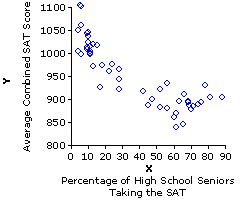
Figure 3.1 shows the relationship between these two variables—percentage of high school seniors taking the SAT versus average state score on the SAT—for all 50 of the states. Within the context of correlation and regression, a two-variable coordinate plot of this general type is typically spoken of as a scatterplot or scattergram. Either way, it is simply a variation on the theme of Cartesian coordinate plotting that you have almost certainly already encountered in your prior educational experience. It is a standard method for graphically representing the relationship that exists between two variables, X and Y, in the case where each particular value of Xi is paired with one particular value of Yi.
Figure 3.1. Percentage of High School Seniors Taking the SAT versus Average Combined State SAT Scores: 1993
|
For the present example, designating the percentage of high school seniors within a state taking the SAT as X, and the state's combined average SAT score as Y, we would have a total of
|
State | Xi Percentage taking SAT | Yi Average SAT score 1i | 2i ::::i 49i 50i X1 | X2 ::::i X49 X50 Y1 | Y2 ::::i Y49 Y50 |
| The next step in bivariate coordinate plotting is to lay out two axes at right angles to each other. By convention, the horizontal axis is assigned to the X variable and the vertical axis to the Y variable, with values of X increasing from left to right and values of Y increasing from bottom to top. | 
|
A further convention in bivariate coordinate plotting applies only to those cases where a causal relationship is known or hypothesized to exist between the two variables. In examining the relationship between two causally related variables, the independent variable is the one that is capable of influencing the other, and the dependent variable is the one that is capable of being influenced by the other. For example, growing taller will tend to make you grow heavier, whereas growing heavier will have no systematic effect on whether you grow taller. In the relationship between human height and weight, therefore, height is the independent variable and weight the dependent variable. The amount of time you spend studying before an exam can affect your subsequent performance on the exam, whereas your performance on the exam cannot retroactively affect the prior amount of time you spent studying for it. Hence, amount of study is the independent variable and performance on the exam is the dependent variable.
In the present SAT example, the percentage of high school seniors within a state who take the SAT can conceivably affect the state's average score on the SAT, whereas the state's average score in any given year cannot retroactively influence the percentage of high school seniors who took the test. Thus, the percentage of high school seniors taking the test is the independent variable, X, while the average state score is the dependent variable, Y. In cases of this type, the convention is to reserve the X axis for the independent variable and the Y axis for the dependent variable. For cases where the distinction between "independent" and "dependent" does not apply, it makes no difference which variable is called X and which is called Y.
In designing a coordinate plot of this type, it is not generally necessary to begin either the X or the Y axis at zero. The X axis can begin at or slightly below the lowest observed value of Xi, and the Y axis can begin at or slightly below the lowest observed value of Yi.
|
| In Figure 3.1b the X axis does begin at zero, because any value much larger than that would lop off the lower end of the distribution of Xi values; whereas the Y axis begins at 800, because the lowest observed value of Yi is 838. |
At any rate, the clear message of Figure 3.1 is that states with relatively low percentages of high school seniors taking the SAT in 1993 tended to have relatively high average SAT scores, while those that had relatively high percentages of high school seniors taking the SAT tended to have relatively low average SAT scores. The relationship is not a perfect one, though it is nonetheless clearly visible to the naked eye. The following version of Figure 3.1 will make it even more visible. It is the same as shown before, except that now we include the straight line that forms the best "fit" of this relationship.We will return to the meaning and derivation of this line a bit later.

| Toggle!
Actually, in this particular example there are two somewhat different patterns that the 50 state data points could be construed as fitting. The first is the pattern delineated by the solid downward slanting straight line, and the second is the one marked out by the dotted and mostly downward sloping curved line that you will see if you click the line labeled "Toggle!" [Click "Toggle!" again to return to the straight line.] |
Figure 3.2 illustrates the various forms that linear correlation is capable of taking. The basic possibilities are: (i) positive correlation; (ii) negative correlation; and (iii) zero correlation. In the case of zero correlation, the coordinate plot will look something like the rather patternless jumble shown in Figure 3.2a, reflecting the fact that there is no systematic tendency for X and Y to be associated, either the one way or the other. The plot for a positive correlation, on the other hand, will reflect the tendency for high values of Xi to be associated with high values of Yi, and vice versa; hence, the data points will tend to line up along an upward slanting diagonal, as shown in Figure 3.2b. The plot for negative correlation will reflect the opposite tendency for high values of Xi to be associated with low values of Yi, and vice versa; hence, the data points will tend to line up along a downward slanting diagonal, as shown in Figure 3.2d.
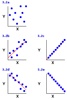 The limiting case of linear correlation, as illustrated in Figures 3.2c and 3.2e, is when the data points line up along the diagonal like beads on a taut string. This arrangement, typically spoken of as perfect correlation, would represent the maximum degree of linear correlation, positive or negative, that could possibly exist between two variables. In the real world you will normally find perfect linear correlations only in the realm of basic physical principles; for example, the relationship between voltage and current in an electrical circuit with constant resistance. Among the less tidy phenomena of the behavioral and biological sciences, positive and negative linear correlations are much more likely to be of the "imperfect" types illustrated in Figures 3.2b and 3.2d.
The Measurement of Linear Correlation
The primary measure of linear correlation is the Pearson product-moment correlation coefficient, symbolized by the lower-case Roman letter r, which ranges in value from
A closely related companion measure of linear correlation is the coefficient of determination, symbolized
We will examine the details of calculation for these two measures in a moment, but first a bit more by way of introducing the general concepts. Figure 3.3 shows four specific examples of r and r2, each produced by taking two very simple sets of X and Y values, namely
and pairing them up in one or another of four different ways. In Example I they are paired in such a way as to produce a perfect positive correlation, resulting in a correlation coefficient of
Figure 3.3. Four Different Pairings of the Same Values of X and Y
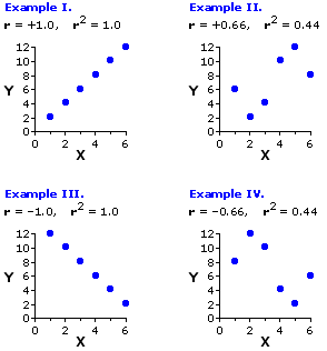
The correlations shown in Examples III and IV are obviously mirror images of the ones just described. For Example III the six values of Xi and Yi are paired in such a way as to produce a perfect negative correlation, which yields a correlation coefficient of
To illustrate the next point in closer detail, we will focus for a moment on the particular pairing of Xi and Yi values that produced the positive correlation shown in Example II of Figure 3.3.
|
Pair | Xi | Yi | 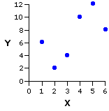
| |
| a b c d e f | 1 2 3 4 5 6 | 6 2 4 10 12 8 |
When you perform the computational procedures for linear correlation and regression, what you are essentially doing is defining the straight line that best fits the bivariate distribution of data points, as shown in the following version of the same graph. This line is spoken of as the regression line, or line of regression, and the criterion for "best fit" is that the sum of the squared vertical distances (the green
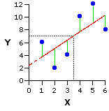
| As it happens, this line of best fit will in every instance pass through the point at which the mean of X and the mean of Y intersect on the graph. In the present example, the mean of X is 3.5 and the mean of Y is 7.0. Their point of intersection occurs at the convergence of the two dotted gray lines. |
The details of this line—in particular, where it begins on the Y axis and the rate at which it slants either upward or downward—will not be explicitly drawn out until we consider the regression side of correlation and regression. Nonetheless, they are implicitly present when you perform the computational procedures for the correlation side of the coin. As indicated above, the slant of the line upward or downward is what determines the sign of the correlation coefficient (r), positive or negative; and the degree to which the data points are lined up along the line, or scattered away from it, determines the strength of the correlation (r2).
You have already encountered the general concept of variance for the case where you are describing the variation that exists among the variate instances of a single variable. The measurement of linear correlation requires an extension of this concept to the case where you are describing the co-variation that exists among the paired bivariate instances of two variables, X and Y, together. We have already touched upon the general concept. In positive correlation, high values of X tend to be associated with high values of Y, and low values of X tend to be associated with low values of Y. In negative correlation, it is the opposite: high values of X tend to be associated with low values of Y, and low values of X tend to be associated with high values of Y. In both cases, the phrase "tend to be associated" is another way of saying that the variability in X tends to be coupled with variability in Y, and vice versa—or, in brief, that X and Y tend to vary together. The raw measure of the tendency of two variables, X and Y, to co-vary is a quantity known as the covariance. As it happens, you will not need to be able to calculate the quantity of covariance in and of itself, because the destination we are aiming for, the calculation of r and r2, can be reached by way of a simpler shortcut. However, you will need to have at least the general concept of it; so keep in mind as we proceed through the next few paragraphs that covariance is a measure of the degree to which two variables, X and Y, co-vary.
In its underlying logic, the Pearson product-moment correlation coefficient comes down to a simple ratio between (i) the amount of covariation between X and Y that is actually observed, and (ii) the amount of covariation that would exist if X and Y had a perfect (100%) positive correlation. Thus
| r = |
observed covariance maximum possible positive covariance
| | |||
| For any n numerical values, a, b, c, etc., the geometric mean is the nth root of the product of those values. Thus, the geometric mean of a and b would be the square root of axb; the geometric mean of a, b and c would be the cube root of axbxc; and so on. |
So the structure of the relationship now comes down to
| r = |
observed covariance sqrt[(varianceX) x (varianceY)]
| | |||
| Recall that "sqrt" means "the square root of." |
Although in principle this relationship involves two variances and a covariance, in practice, through the magic of algebraic manipulation, it boils down to something that is computationally much simpler. In the following formulation you will immediately recognize the meaning of SSX, which is the sum of squared deviates for X; by extension, you will also be able to
| In order to get from the formula above to the one below, you will need to recall that the variance (s2) of a set of values is simply the average of the squared deviates: SS/N. |
The third item, SCXY, denotes a quantity that we will speak of as the sum of co-deviates; and as you can no doubt surmise from the name, it is something very closely akin to a sum of squared deviates. SSX is the raw measure of the variability among the values of Xi; SSY is the raw measure of the variability among the values of Yi; and SCXY is the raw measure of the co-variability of X and Y together.
| r = |
SCXY sqrt[SSX x SSY]
| | |||
| To understand this kinship, recall from Chapter 2 precisely what is meant by the term "deviate." |
|
For any particular item in a set of measures of the variable X, Similarly, for any particular item in a set of measures of the variable Y, |
| As you have probably already guessed, a co-deviate pertaining to a particular pair of XY values involves the deviateX of the Xi member of the pair and the deviateY of the Yi member of the pair. The specific way in which these two are joined to form the co-deviate is |
co-deviateXY = (deviateX) x (deviateY) |
| And finally, the analogy between a co-deviate and a squared deviate: |
For a value of Xi, the squared deviate is For a value of Yi it is And for a pair of Xi and Yi values, the co-deviate is |
This should give you a sense of the underlying concepts. Just keep in mind, no matter what particular computational sequence you follow when you calculate the correlation coefficient, that what you are fundamentally calculating is the ratio
| r = |
observed covariance maximum possible positive covariance
| | |||
| r = |
SCXY sqrt[SSX x SSY]
| | |||
Now for the nuts-and-bolts of it. Here, once again, is the particular pairing of Xi and Yi values that produced the positive correlation shown in Example II of Figure 3.3. But now we subject them to a bit of number-crunching, calculating the square of each value of Xi and Yi, along with the cross-product of each XiYi pair. These are the items that will be required for the calculation of the three summary quantities in the above formula: SSX, SSY, and SSXY.
|
Pair | Xi | Yi | Xi2 | Yi2 | XiYi |
| ||||||||||||||
| a b c d e f | 1 2 3 4 5 6 | 6 2 4 10 12 8 | 1 4 9 16 25 36 | 36 4 16 100 144 64 | 6 4 12 40 60 48 sums | 21 | 42 | 91 | 364 | 170 |
| | ||||||||
SSX : sum of squared deviates for Xi valuesT
You saw in Chapter 2 that the sum of squared deviates for a set of Xi values can be calculated according to the computational formulaT
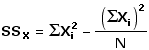
In the present example,
Thus:
SSY : sum of squared deviates for Yi valuesT
Similarly, the sum of squared deviates for a set of Yi values can be calculated according to the formulaT
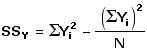
In the present example,T
Thus:
SCXY : sum of co-deviates for paired values of Xi and YiT
A moment ago we observed that the sum of co-deviates for paired values of Xi and Yi is analogous to the sum of squared deviates for either of those variables separately. You will probably be able to see that this analogy also extends to the computational formula for the sum of co-deviates:T
Again, for the present example,T
(
Once you have these preliminaries,T
you can then easily calculate the correlation coefficient as
| r = |
SCXY sqrt[SSX x SSY]
|
| = |
23.0 | sqrt[17.5 x 70.0] = +0.66 |
| | |||||||
r2 = (+0.66)2 = 0.44 |
To make sure you have a solid grasp of these matters, please take a moment to work your way through the details of Table 3.1, which will show the data and calculations for each of the examples of Figure 3.3. Recall that each example starts out with the same values of Xi and Yi; they differ only with respect to how these values are paired up with one another.
End of Chapter 3, Part 1.
Return to Top of Part 1
Go to Chapter 3, Part 2
| Home | Click this link only if the present page does not appear in a frameset headed by the logo Concepts and Applications of Inferential Statistics |