©Richard Lowry, 1999-
All rights reserved.
Chapter 2. Distributions Part 1
In its simplest form, a distribution is just a list of the individual measures that are taken on some particular variable. Suppose, for example, that 12 students in a statistics course have achieved the following scores on their first exam, arranged in order from lowest to highest:
Take a close look at the texture of interrelationships among these scores—in particular, how they spread out and how they cluster together—and you are in effect examining their distribution. It is a very simple concept, made even simpler by the fact that distributions are very easy to visualize.
Indeed, in most cases a single glimpse of a graphic representation of a distribution will tell you more about it than several minutes of staring at a bare list of numbers. One very simple form of graphic representation is shown below in Figure 2.1.
Figure 2.1. Distribution of the Scores of Twelve Students on a Statistics Exam
The horizontal axis lays out that portion of the scale of exam scores that includes all 12 of the listed values, and each student's individual score on the exam is represented by a box placed at the appropriate point on the scale. Thus, the box for student 'a' is placed at 61 on the scale, the box representing student 'b' falls at 69, and so forth. You will note that the scale of exam scores in Figure 2.1 is drawn as though it were an equal interval scale. For purposes of this example, we will assume that it is an equal interval scale. In fact, most of what we will be saying in this chapter pertains to distributions that derive from equal interval scales of measurement. It is also possible to speak of distributions in connection with ordinal scale and categorical measurement, but that is something we will save for later.
The type of graph shown in Figure 2.1 is useful when you are interested in conveying detailed information about each and every measure in the distribution, though with larger numbers of measures it can become quite cumbersome. Besides, for most practical statistical purposes your interest is not so much in the individual identity of your measures as in the overall shape and texture of the distribution that they compose.
The frames of Figure 2.2 show three other forms of graphic representation that typically serve these purposes much more effectively.
All three are representing the same basic facts, though each in a somewhat different format.
The process of constructing these graphs begins by breaking the scale of exam scores into intervals and then counting up the number of individual measures that fall within each interval. The resulting aggregate information can then be displayed in terms of either absolute frequencies (the actual number of cases within each interval) or relative frequencies (percentages or proportions). For the present illustration we display it only in terms of absolute frequencies. The horizontal axis of the three graphs represents the intervals that the scale of exam scores is broken into. For present purposes we simply break the scale into the four conventional academic grade-score intervals:
The following table shows the number of exam scores that fall into each of these intervals, and the adjacent image frame will show each of these three ways of graphing the distribution as you click the links beneath the frame. If you are new to this type of subject matter, you might want to take a moment with each graph to figure out exactly what information it is representing.
In the chapters of this text you will find quite a number of smoothed polygons of the type shown in Figure 2.2c. As you encounter them, please keep in mind that this is a kind of special purpose graphic format usually reserved either for describing abstract theoretical distributions, of which you will see much more in subsequent chapters, or else for providing a global overview of the shape of a distribution without getting too bogged down in details. For most other purposes (for researchers, reporting the results of research; for students, doing exams and homework assignments) the convention is to represent the frequency aspects of a distribution with either a histogram or a regular (i.e., non-smoothed) polygon.
The Parameters of Distributions
The term parameter comes from two Greek words, para ('beside,' 'along side of') and metron (a unit of measurement), that combine to convey the meaning of a fixed limit or boundary. When you define something (from the Latin definire, 'to limit'), you are in effect laying out its limits or boundaries. Hence, the parameters of a distribution are its defining characteristics.
To illustrate, suppose that the department of psychology at a fairly large institution is concurrently offering six sections of the introductory statistics course. Although these sections are expected to cover the same general range of subject matter, they are otherwise independent of each other, taught by different instructors who are free to choose their own text materials and construct their own exams. Figure 2.3 portrays the distributions of exam scores for these six sections, each in the form of a smoothed frequency polygon. In each graph, the horizontal axis delineates the exam-score intervals, while the vertical axis is scaled in terms of the percentages of students whose scores fell within the various intervals. Note that these horizontal axes now show an additional interval on the left, defined as >50 and <60, to accommodate the regrettable fact that several students among the six sections ended up with grades between 50 and 59.99... . Please take a moment to examine and compare the shapes of these six distributions before going on to the commentary that follows.
Figure 2.3. Distributions of Exam Scores in Six Sections of a Statistics Course
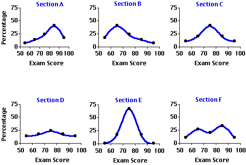
The main parameters of a distribution are generally spoken of as (i) central tendency, (ii) variability, (iii) skew, (iv) kurtosis, and (v) modality. Central tendency and variability will need to be examined separately in considerable detail, since a large part of the work we will doing in this webtext requires that these two parameters be both clearly understood and precisely measured. The remaining three parameters in the list also require a clear understanding, though for most practical statistical work it will not be necessary to measure them in detail. We will begin with a general conceptual introduction to the parameters of skew, kurtosis, and modality, and then shift gears to examine central tendency and variability in greater depth and detail.
¶Skew
The term skew comes from an Old French word meaning to shun or avoid. It is the same linguistic ancestor from which we get the English words 'eschew,' which also means to shun or avoid, and 'askew,' which conveys the meaning of lopsided or tilted off to one side. A skewed distribution is therefore one that is askew, lopsided, tending to shun or avoid one or the other of the extremes of the range within which it falls.
Examine the first two graphs in Figure 2.3 (repeated below) and you will see that the distributions of exam scores for Sections A and B are both conspicuously skewed, though in opposite directions. In Section A the exam scores tend to cluster toward the higher end of the range and taper off toward the lower end, whereas in Section B they tend to cluster toward the lower end of the range and taper off toward the higher end. In general, a distribution that is lopsidedly heavy at the higher end of the range and light at the lower end (e.g., Section A) is described as a negatively skewed distribution, while one that is heavy at the lower end and light at the higher end (e.g., Section B) is spoken of as a positively skewed distribution. Or to put it in pictorial terms, a negatively skewed distribution is one whose elongated tail extends to the left (the low or "negative") end of the range, while a positively skewed distribution is one whose elongated tail extends to the right (the high or "positive") end of the range.
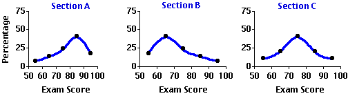
An unskewed distribution, on the other hand, is one that is not lopsided in either the one direction or the other; typically it has two tails that trail off in both directions symmetrically. An example of an unskewed distribution is the third graph in Figure 2.3 showing the symmetrical distribution of exam scores in Section C.
¶Kurtosis
Kurtosis (from a Greek word meaning 'curvature' or 'convex') refers to whether the shape of a distribution is relatively short and flat, or tall and slender, or somewhere in-between those two extremes. If it is short and flat, like the distribution shown for Section D, it is described as platykurtic (flat-curved); if it is tall and slender, like the distribution shown for Section E, it is spoken of as leptokurtic (slender-curved); and if it is neither the one extreme nor the other, like the distribution shown for Section C, it is described as mesokurtic (medium-curved). In a platykurtic distribution the individual measures are spread out fairly uniformly across their range, whereas in a leptokurtic distribution they tend to cluster compactly at some particular point in the range.
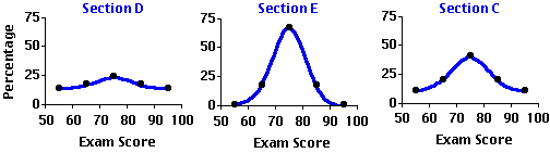
Thus, the exam scores for Section D are distributed fairly uniformly among the five intervals, with only a slight tendency to cluster and form a peak in the vicinity of the third interval (70 to 79.99...). The scores for Section E, on the other hand, have a quite pronounced tendency to cluster in the third interval, with only a few scores falling outside this interval. In the mesokurtic distribution illustrated by Section C the clustering is more moderate than in the leptokurtic distribution, and the curve as it falls away from the peak is more tapering than in the platykurtic distribution. A class containing approximately equal numbers of students whose mastery of the subject matter is very strong, quite strong, moderately strong, not so strong, and so on, would tend to produce the platykurtic distribution shown for Section D, while a class containing a large majority of students who all have approximately the same level of mastery would tend to produce a leptokurtic distribution of the kind shown for Section E.
¶Modality
Modality refers simply to the number of distinct peaks, or areas of cluster, that appear within a distribution, with each such peak being spoken of as a mode. A distribution with only one distinct peak is described as unimodal; if it has two distinct peaks it is spoken of as bimodal; three peaks, trimodal; and so on. Most distributions that you are likely to encounter will be either unimodal or bimodal. Only rarely will you find distributions that have three or more distinct peaks.
In Figure 2.3, the distributions for Sections A, B, C, D, and E are all unimodal distributions with varying degrees of skew and kurtosis. The plot for Section F, on the other hand, portrays a bimodal distribution with one mode in the vicinity of the second interval (60 to 69.99...) and another in the vicinity of the fourth interval (80 to 89.99...). When the two modes of a bimodal distribution are of unequal prominence, as in the present case, they are distinguished from one another by the designations major and minor. Thus, the more prominent peak on the right is the major mode of the distribution, while the less prominent one on the left is the minor mode.
Whenever you find bimodality in a distribution, the first thing to consider is the possibility that what you are really looking at is two distributions mixed together. Suppose, for example, that you were to plot the frequency distribution of the heights of 100 male elementary school pupils. If it were to happen that 60 of your subjects were fifth graders and the other 40 were third graders, your distribution would almost certainly end up as bimodal. Indeed, its general outlines would probably look quite a lot like the distribution of exam scores for Section F, with the minor mode produced by the height distribution of the smaller number of younger and shorter third graders and the major mode produced by the height distribution of the larger number of older and taller fifth graders. Similarly, suppose that Section F is composed of two fairly distinct groups of students, the larger group quite well prepared for the exam and the smaller group not so well prepared. The larger well prepared group would produce the major mode of the distribution, while the smaller not so well prepared group would produce the minor mode.
¶Central Tendency and Variability
Although skew, kurtosis, and modality are each important and indispensable concepts for understanding the general nature of distributions, the parameters with which you will need to become most intimately acquainted are those of central tendency and variability. By way of brief preview, central tendency refers to the tendency of the individual measures in a distribution to cluster together toward some point of aggregation, while variability describes the contrary tendency for the individual measures to disperse or spread out away from each other. Basically, they are refined variations on the complementary themes of closeness versus separation, similarity versus difference. Variability refers to the overall separations and differences that exist among the individual measures in a distribution, while central tendency refers to their closeness and similarity.
Among the six exam score distributions portrayed in Figure 2.3, the clearest illustrations of central tendency and variability are found in the symmetrical and unimodal plots for Sections C, D, and E. The platykurtic distribution for Section D shows a fairly weak tendency to cluster in the region of the third interval and a quite strong complementary tendency to disperse away from that point of central tendency. The leptokurtic distribution for Section E, on the other hand, shows a quite strong tendency to cluster in the vicinity of the third interval and only a weak tendency to disperse away from it.
The mesokurtic distribution for Section C falls in-between these two extremes, showing both a moderate tendency to cluster and a moderate tendency to disperse. The remaining three plots in Figure 2.3 also illustrate central tendency and variability, although they do so somewhat more complexly. If most of the dispersion within a distribution falls asymmetrically to either the left or the right side of the region of cluster, the result is a skewed distribution such as the ones shown for Sections A and B. Even more complex is the bimodal distribution for Section F, for here you have two distinct regions of clustering and a considerable degree of overall dispersion resulting from the separation of those regions.
In the next two sections we will examine the various ways in which these two very important parameters of a distribution can be measured.
Measures of Central Tendency
Potentially, you could have two quite different types of measures of central tendency. The first would measure the strength of the tendency for measures to cluster together, and the second would measure the location where the clustering tends to occur. Typically when we speak of measures of central tendency, it is the second type of measure that we are talking about—the measure of location. The measure of the strength of the tendency, on the other hand, is actually the flip-side of the measures of variability that we will be examining in the section that follows this one.
The three most commonly used measures of the location of central tendency are the mode, the median, and the mean. In brief, the mode is the point or region within a distribution where the largest number of individual measures congregate, the median is the midpoint of all the individual measures, and the mean is the arithmétic average of all the individual measures.
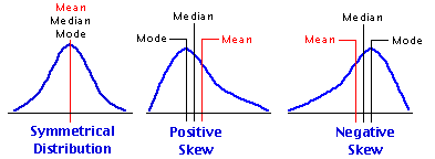
As a rule, the only time you will find the mode and median to be precisely coincident with the mean is when the distribution is unimodal and perfectly symmetrical. In skewed distributions the mean, median, and mode will tend to be separated from one another, with the mean falling toward the tail of the skew, the mode falling away from the tail, at the peak, and the median falling somewhere in-between. Thus, in a positively skewed distribution the mean will be to the right, the mode to the left, and the median in-between, while in a negatively skewed distribution the mean will be to the left, the mode to the right, and the median in-between. These relationships among the three measures of central tendency are shown below in Figure 2.4.
Figure 2.4. Relationships of the Mean, Median, and Mode in Symmetrical and Skewed Distributions
If your purposes in assessing the central tendency of a distribution are purely descriptive, your best procedure would be to examine not just the mode or the median or the mean separately, but all three together. But once you step beyond those limited purposes into the much broader realm of analytical and inferential statistics, the mode and the median become virtually useless The reason for this is that measures of mode and median do not have the properties of an equal interval scale of measurement—this is true even if the data on which they are based do have the properties of an equal interval scale—hence they cannot meaningfully be subjected to any further mathematical operations. In brief, they are both mathematical dead ends. The mean, on the other hand, providing it is based on data that derive from an equal interval scale of measurement, will itself have the properties of an equal interval scale and thus can be subjected to further mathematical operations.
The arithmétic mean of a distribution is simply the sum of all the values in the distribution divided by the number of values. Thus, the mean of a distribution consisting of the values 1, 2, 3, 4, and 5 is
You can think of the mean as the balance point within a distribution, a kind of center of gravity to which each measure in the distribution contributes in proportion to its size. Thus a distribution consisting of the values 1, 2, 2, and 3 would balance, as shown below, at (1+2+2+3)/4 = 2.0.
Replace any of the four values in this distribution with some other value, and the balance point shifts accordingly. In the following illustration we replace the 3, first with a 5 and then with a 9. For the first replacement the balance point shifts from 2.0 to 2.5, and for the second it shifts even further to 3.5.
And please take special note of the tidy proportionality of these shifts. In this particular distribution there are four values, each contributing 1/4 = 25% to the determination of the mean. Increase any particular value by one point (one unit of measurement), and you will increase the mean by 0.25 units; increase the value by two points, and you will increase the mean by 0.50 units; and so on. Conversely, decrease any value in the distribution by a certain amount and you will decrease the mean by 25% of that amount. In a distribution composed of three values, the contribution of each individual value would be 1/3 = 33.3%; in one composed of 10 values it would be 1/10 = 10%; and so on.
And now for a formula and an introduction to some conventional statistical notation. When you calculate the mean of a distribution you are performing two separate computational steps: first, you are taking the sum of all the individual values in the distribution; and then you are dividing that sum by the total number of values in the distribution. In the formulaic description of these two steps that we gave earlier, notice that the second step is expressed not in words but by an abstract symbol:
The horizontal line between "sum of all values" and "number of values" is a conventional, concise symbolic way of saying something that would otherwise be very cumbersome to say, especially if it needed to be said over and over again in a variety of different situations: namely, "take whatever is above the line and divide it by whatever is below it." As it happens, you have a very long-standing familiarity with this particular symbolic notation, as you do with its substitutes "÷" and "/ ", as well as with its cousins "+", "—", and "x", and so your eye and mind see immediately precisely what operation it is telling you to perform. The formula that follows replaces each of the other terms and operations involved in the calculation of the mean with symbols that are equally concise. Please do not be intimidated by these symbols, for there is nothing at all elusive or arcane about them. It is simply a matter of familiarization. After a while their meanings will leap out at you as though you had been using them all your life.
Formula for the Calculation of the Arithmétic Mean
¶Definition of Terms
¶FormulaT
Substitute the symbolic expressions for the verbal phrases in this structure, and you haveT
The best way to get a feeling for what a formula does is to apply it to a specific numerical example. Here again is the distribution of 12 exam scores mentioned earlier.
It is as simple as that.
Actually, the value of the mean that you would calculate in this example would not come out to precisely 81.08, but rather to 81.08333... . Almost always when you calculate a mean you will end up having to do some rounding. However, do be careful not to round it down too much, because the mean often enters into subsequent calculations that can be thrown considerably askew if it is rounded excessively. In general, it is good practice to calculate the mean out to at least one decimal place beyond the number of decimal places contained in the original data. Thus, if the original data have no decimal places, as in the present example, carry the mean out to at least one decimal place; if they have one decimal place, carry it out to two; if they have two decimal places, carry it out to three; and so on. [SideTrip on the mechanics of rounding.]
End of Chapter 2, Part 1.| 61, 69, 72, 76, 78, 83, 85, 85, 86, 88, 93, 97 |
Indeed, in most cases a single glimpse of a graphic representation of a distribution will tell you more about it than several minutes of staring at a bare list of numbers. One very simple form of graphic representation is shown below in Figure 2.1.
Figure 2.1. Distribution of the Scores of Twelve Students on a Statistics Exam
|
The type of graph shown in Figure 2.1 is useful when you are interested in conveying detailed information about each and every measure in the distribution, though with larger numbers of measures it can become quite cumbersome. Besides, for most practical statistical purposes your interest is not so much in the individual identity of your measures as in the overall shape and texture of the distribution that they compose.
The frames of Figure 2.2 show three other forms of graphic representation that typically serve these purposes much more effectively.
| The first, shown in Figure 2.2a, is spoken of as a frequency histogram (from the Greek 'histos,' meaning 'loom,' 'warp,' 'web'), while the second, shown in Figure 2.2b, is known as a frequency polygon (from the Greek 'polys' and 'gonia,' meaning 'multiple angles'). The third graph, shown in Figure 2.2c, is also a form of frequency polygon, but with the curve drawn smoothly rather than with straight lines and angles. | 
|
The process of constructing these graphs begins by breaking the scale of exam scores into intervals and then counting up the number of individual measures that fall within each interval. The resulting aggregate information can then be displayed in terms of either absolute frequencies (the actual number of cases within each interval) or relative frequencies (percentages or proportions). For the present illustration we display it only in terms of absolute frequencies. The horizontal axis of the three graphs represents the intervals that the scale of exam scores is broken into. For present purposes we simply break the scale into the four conventional academic grade-score intervals:
| (i) | >60 and <70 (equal to or greater than 60 and less than 70)
| (ii)
| >70 and <80 (equal to or greater than 70 and less than 80)
| (iii)
| >80 and <90 (equal to or greater than 80 and less than 90)
| (iv)
| >90 (equal to or greater than 90)
| |
The following table shows the number of exam scores that fall into each of these intervals, and the adjacent image frame will show each of these three ways of graphing the distribution as you click the links beneath the frame. If you are new to this type of subject matter, you might want to take a moment with each graph to figure out exactly what information it is representing.
| Exam Score | Interval | Frequency in Interval |  Figure 2.2a. frequency histogram Figure 2.2b. frequency polygon Figure 2.2c. smoothed frequency polygon 61
| >60 | <70 2
| 69
| 72
| >70 | <80 3
| 76
| 78
| 83
| >80 | <90 5
| 85
| 85
| 86
| 88
| 93
| >90
| 2
| 97
|
| | |||
In the chapters of this text you will find quite a number of smoothed polygons of the type shown in Figure 2.2c. As you encounter them, please keep in mind that this is a kind of special purpose graphic format usually reserved either for describing abstract theoretical distributions, of which you will see much more in subsequent chapters, or else for providing a global overview of the shape of a distribution without getting too bogged down in details. For most other purposes (for researchers, reporting the results of research; for students, doing exams and homework assignments) the convention is to represent the frequency aspects of a distribution with either a histogram or a regular (i.e., non-smoothed) polygon.
The Parameters of Distributions
The term parameter comes from two Greek words, para ('beside,' 'along side of') and metron (a unit of measurement), that combine to convey the meaning of a fixed limit or boundary. When you define something (from the Latin definire, 'to limit'), you are in effect laying out its limits or boundaries. Hence, the parameters of a distribution are its defining characteristics.
To illustrate, suppose that the department of psychology at a fairly large institution is concurrently offering six sections of the introductory statistics course. Although these sections are expected to cover the same general range of subject matter, they are otherwise independent of each other, taught by different instructors who are free to choose their own text materials and construct their own exams. Figure 2.3 portrays the distributions of exam scores for these six sections, each in the form of a smoothed frequency polygon. In each graph, the horizontal axis delineates the exam-score intervals, while the vertical axis is scaled in terms of the percentages of students whose scores fell within the various intervals. Note that these horizontal axes now show an additional interval on the left, defined as >50 and <60, to accommodate the regrettable fact that several students among the six sections ended up with grades between 50 and 59.99... . Please take a moment to examine and compare the shapes of these six distributions before going on to the commentary that follows.
Figure 2.3. Distributions of Exam Scores in Six Sections of a Statistics Course
The main parameters of a distribution are generally spoken of as (i) central tendency, (ii) variability, (iii) skew, (iv) kurtosis, and (v) modality. Central tendency and variability will need to be examined separately in considerable detail, since a large part of the work we will doing in this webtext requires that these two parameters be both clearly understood and precisely measured. The remaining three parameters in the list also require a clear understanding, though for most practical statistical work it will not be necessary to measure them in detail. We will begin with a general conceptual introduction to the parameters of skew, kurtosis, and modality, and then shift gears to examine central tendency and variability in greater depth and detail.
¶Skew
The term skew comes from an Old French word meaning to shun or avoid. It is the same linguistic ancestor from which we get the English words 'eschew,' which also means to shun or avoid, and 'askew,' which conveys the meaning of lopsided or tilted off to one side. A skewed distribution is therefore one that is askew, lopsided, tending to shun or avoid one or the other of the extremes of the range within which it falls.
Examine the first two graphs in Figure 2.3 (repeated below) and you will see that the distributions of exam scores for Sections A and B are both conspicuously skewed, though in opposite directions. In Section A the exam scores tend to cluster toward the higher end of the range and taper off toward the lower end, whereas in Section B they tend to cluster toward the lower end of the range and taper off toward the higher end. In general, a distribution that is lopsidedly heavy at the higher end of the range and light at the lower end (e.g., Section A) is described as a negatively skewed distribution, while one that is heavy at the lower end and light at the higher end (e.g., Section B) is spoken of as a positively skewed distribution. Or to put it in pictorial terms, a negatively skewed distribution is one whose elongated tail extends to the left (the low or "negative") end of the range, while a positively skewed distribution is one whose elongated tail extends to the right (the high or "positive") end of the range.
An unskewed distribution, on the other hand, is one that is not lopsided in either the one direction or the other; typically it has two tails that trail off in both directions symmetrically. An example of an unskewed distribution is the third graph in Figure 2.3 showing the symmetrical distribution of exam scores in Section C.
¶Kurtosis
Kurtosis (from a Greek word meaning 'curvature' or 'convex') refers to whether the shape of a distribution is relatively short and flat, or tall and slender, or somewhere in-between those two extremes. If it is short and flat, like the distribution shown for Section D, it is described as platykurtic (flat-curved); if it is tall and slender, like the distribution shown for Section E, it is spoken of as leptokurtic (slender-curved); and if it is neither the one extreme nor the other, like the distribution shown for Section C, it is described as mesokurtic (medium-curved). In a platykurtic distribution the individual measures are spread out fairly uniformly across their range, whereas in a leptokurtic distribution they tend to cluster compactly at some particular point in the range.
Thus, the exam scores for Section D are distributed fairly uniformly among the five intervals, with only a slight tendency to cluster and form a peak in the vicinity of the third interval (70 to 79.99...). The scores for Section E, on the other hand, have a quite pronounced tendency to cluster in the third interval, with only a few scores falling outside this interval. In the mesokurtic distribution illustrated by Section C the clustering is more moderate than in the leptokurtic distribution, and the curve as it falls away from the peak is more tapering than in the platykurtic distribution. A class containing approximately equal numbers of students whose mastery of the subject matter is very strong, quite strong, moderately strong, not so strong, and so on, would tend to produce the platykurtic distribution shown for Section D, while a class containing a large majority of students who all have approximately the same level of mastery would tend to produce a leptokurtic distribution of the kind shown for Section E.
¶Modality
Modality refers simply to the number of distinct peaks, or areas of cluster, that appear within a distribution, with each such peak being spoken of as a mode. A distribution with only one distinct peak is described as unimodal; if it has two distinct peaks it is spoken of as bimodal; three peaks, trimodal; and so on. Most distributions that you are likely to encounter will be either unimodal or bimodal. Only rarely will you find distributions that have three or more distinct peaks.
In Figure 2.3, the distributions for Sections A, B, C, D, and E are all unimodal distributions with varying degrees of skew and kurtosis. The plot for Section F, on the other hand, portrays a bimodal distribution with one mode in the vicinity of the second interval (60 to 69.99...) and another in the vicinity of the fourth interval (80 to 89.99...). When the two modes of a bimodal distribution are of unequal prominence, as in the present case, they are distinguished from one another by the designations major and minor. Thus, the more prominent peak on the right is the major mode of the distribution, while the less prominent one on the left is the minor mode.
Whenever you find bimodality in a distribution, the first thing to consider is the possibility that what you are really looking at is two distributions mixed together. Suppose, for example, that you were to plot the frequency distribution of the heights of 100 male elementary school pupils. If it were to happen that 60 of your subjects were fifth graders and the other 40 were third graders, your distribution would almost certainly end up as bimodal. Indeed, its general outlines would probably look quite a lot like the distribution of exam scores for Section F, with the minor mode produced by the height distribution of the smaller number of younger and shorter third graders and the major mode produced by the height distribution of the larger number of older and taller fifth graders. Similarly, suppose that Section F is composed of two fairly distinct groups of students, the larger group quite well prepared for the exam and the smaller group not so well prepared. The larger well prepared group would produce the major mode of the distribution, while the smaller not so well prepared group would produce the minor mode.
¶Central Tendency and Variability
Although skew, kurtosis, and modality are each important and indispensable concepts for understanding the general nature of distributions, the parameters with which you will need to become most intimately acquainted are those of central tendency and variability. By way of brief preview, central tendency refers to the tendency of the individual measures in a distribution to cluster together toward some point of aggregation, while variability describes the contrary tendency for the individual measures to disperse or spread out away from each other. Basically, they are refined variations on the complementary themes of closeness versus separation, similarity versus difference. Variability refers to the overall separations and differences that exist among the individual measures in a distribution, while central tendency refers to their closeness and similarity.
Among the six exam score distributions portrayed in Figure 2.3, the clearest illustrations of central tendency and variability are found in the symmetrical and unimodal plots for Sections C, D, and E. The platykurtic distribution for Section D shows a fairly weak tendency to cluster in the region of the third interval and a quite strong complementary tendency to disperse away from that point of central tendency. The leptokurtic distribution for Section E, on the other hand, shows a quite strong tendency to cluster in the vicinity of the third interval and only a weak tendency to disperse away from it.
The mesokurtic distribution for Section C falls in-between these two extremes, showing both a moderate tendency to cluster and a moderate tendency to disperse. The remaining three plots in Figure 2.3 also illustrate central tendency and variability, although they do so somewhat more complexly. If most of the dispersion within a distribution falls asymmetrically to either the left or the right side of the region of cluster, the result is a skewed distribution such as the ones shown for Sections A and B. Even more complex is the bimodal distribution for Section F, for here you have two distinct regions of clustering and a considerable degree of overall dispersion resulting from the separation of those regions.
In the next two sections we will examine the various ways in which these two very important parameters of a distribution can be measured.
Measures of Central Tendency
Potentially, you could have two quite different types of measures of central tendency. The first would measure the strength of the tendency for measures to cluster together, and the second would measure the location where the clustering tends to occur. Typically when we speak of measures of central tendency, it is the second type of measure that we are talking about—the measure of location. The measure of the strength of the tendency, on the other hand, is actually the flip-side of the measures of variability that we will be examining in the section that follows this one.
The three most commonly used measures of the location of central tendency are the mode, the median, and the mean. In brief, the mode is the point or region within a distribution where the largest number of individual measures congregate, the median is the midpoint of all the individual measures, and the mean is the arithmétic average of all the individual measures.
As a rule, the only time you will find the mode and median to be precisely coincident with the mean is when the distribution is unimodal and perfectly symmetrical. In skewed distributions the mean, median, and mode will tend to be separated from one another, with the mean falling toward the tail of the skew, the mode falling away from the tail, at the peak, and the median falling somewhere in-between. Thus, in a positively skewed distribution the mean will be to the right, the mode to the left, and the median in-between, while in a negatively skewed distribution the mean will be to the left, the mode to the right, and the median in-between. These relationships among the three measures of central tendency are shown below in Figure 2.4.
Figure 2.4. Relationships of the Mean, Median, and Mode in Symmetrical and Skewed Distributions
|
If your purposes in assessing the central tendency of a distribution are purely descriptive, your best procedure would be to examine not just the mode or the median or the mean separately, but all three together. But once you step beyond those limited purposes into the much broader realm of analytical and inferential statistics, the mode and the median become virtually useless The reason for this is that measures of mode and median do not have the properties of an equal interval scale of measurement—this is true even if the data on which they are based do have the properties of an equal interval scale—hence they cannot meaningfully be subjected to any further mathematical operations. In brief, they are both mathematical dead ends. The mean, on the other hand, providing it is based on data that derive from an equal interval scale of measurement, will itself have the properties of an equal interval scale and thus can be subjected to further mathematical operations.
The arithmétic mean of a distribution is simply the sum of all the values in the distribution divided by the number of values. Thus, the mean of a distribution consisting of the values 1, 2, 3, 4, and 5 is
| mean = | sum of all values number of values
| = | 1 + 2 + 3 + 4 + 5 | 5 = | 15 | 5 = 3.0 | | ||||||
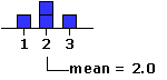
You can think of the mean as the balance point within a distribution, a kind of center of gravity to which each measure in the distribution contributes in proportion to its size. Thus a distribution consisting of the values 1, 2, 2, and 3 would balance, as shown below, at (1+2+2+3)/4 = 2.0.
 |
Replace any of the four values in this distribution with some other value, and the balance point shifts accordingly. In the following illustration we replace the 3, first with a 5 and then with a 9. For the first replacement the balance point shifts from 2.0 to 2.5, and for the second it shifts even further to 3.5.
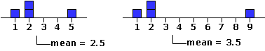 |
And please take special note of the tidy proportionality of these shifts. In this particular distribution there are four values, each contributing 1/4 = 25% to the determination of the mean. Increase any particular value by one point (one unit of measurement), and you will increase the mean by 0.25 units; increase the value by two points, and you will increase the mean by 0.50 units; and so on. Conversely, decrease any value in the distribution by a certain amount and you will decrease the mean by 25% of that amount. In a distribution composed of three values, the contribution of each individual value would be 1/3 = 33.3%; in one composed of 10 values it would be 1/10 = 10%; and so on.
And now for a formula and an introduction to some conventional statistical notation. When you calculate the mean of a distribution you are performing two separate computational steps: first, you are taking the sum of all the individual values in the distribution; and then you are dividing that sum by the total number of values in the distribution. In the formulaic description of these two steps that we gave earlier, notice that the second step is expressed not in words but by an abstract symbol:
| mean = | sum of all values number of values |
Formula for the Calculation of the Arithmétic Mean
¶Definition of Terms
| N | = the number of individual values in the distribution.
| Xi | This is a symbol referring to the N individual values of your distribution in the abstract. Each value in the distribution is spoken of as a variate instance of the variable X. Thus, the first value in the distribution would be X1; the second would be X2; and so on to the last value, XN. | This symbol (upper-case Greek letter 'sigma') does not represent a numerical value, but rather, like "+" and "—", a mathematical operation that is to be performed upon certain designated numerical values. It is a computational signpost saying "calculate the sum of these values"; hence its conventional name, the summation sign. Thus for a distribution of size N = 4, consisting of the values 6, 9, 12, and 15, the expression | M | We will use the bold-face letter M to represent the arithmétic mean of a distribution. Thus MX would be the mean of a set of X values, MY would be the mean of a set of Y values, and so on. [Note that hardcopy statistics textbooks will often represent the mean of X (Y, Z, etc.) by writing the letter X (Y, Z, etc.) with a horizontal bar over it.]
| |
¶FormulaT
| mean = | sum of all values number of values |
Substitute the symbolic expressions for the verbal phrases in this structure, and you haveT
| MX = | TNT |
The best way to get a feeling for what a formula does is to apply it to a specific numerical example. Here again is the distribution of 12 exam scores mentioned earlier.
Add these N = 12 scores together and you will find that their sum comes out to 973. Substitute this value into the formula for the mean, and you haveT
X1 X2 X3 X4 X5 X6 X7 X8 X9 X10 X11 X12 61 69 72 76 78 83 85 85 86 88 93 97
| MX = | TNT | = | 973 12 | = 81.08 |
It is as simple as that.
Actually, the value of the mean that you would calculate in this example would not come out to precisely 81.08, but rather to 81.08333... . Almost always when you calculate a mean you will end up having to do some rounding. However, do be careful not to round it down too much, because the mean often enters into subsequent calculations that can be thrown considerably askew if it is rounded excessively. In general, it is good practice to calculate the mean out to at least one decimal place beyond the number of decimal places contained in the original data. Thus, if the original data have no decimal places, as in the present example, carry the mean out to at least one decimal place; if they have one decimal place, carry it out to two; if they have two decimal places, carry it out to three; and so on. [SideTrip on the mechanics of rounding.]
Return to Top of Part 1
Go to Chapter 2, Part 2
| Home | Click this link only if the present page does not appear in a frameset headed by the logo Concepts and Applications of Inferential Statistics |